HAVING A DIFFICULT TIME CHOOSING YOUR OUTFIT? LET ME HELP.
Using a color palette when choosing outfits for a photo session helps create a cohesive, polished look while still allowing each person’s personality and style to shine. Instead of everyone wearing the exact same color, choose a few complementary colors that work well together and coordinate outfits around those shades.
(shown above you will see the utilization of the Soft & Neutral palette)
C wylie color palette examples
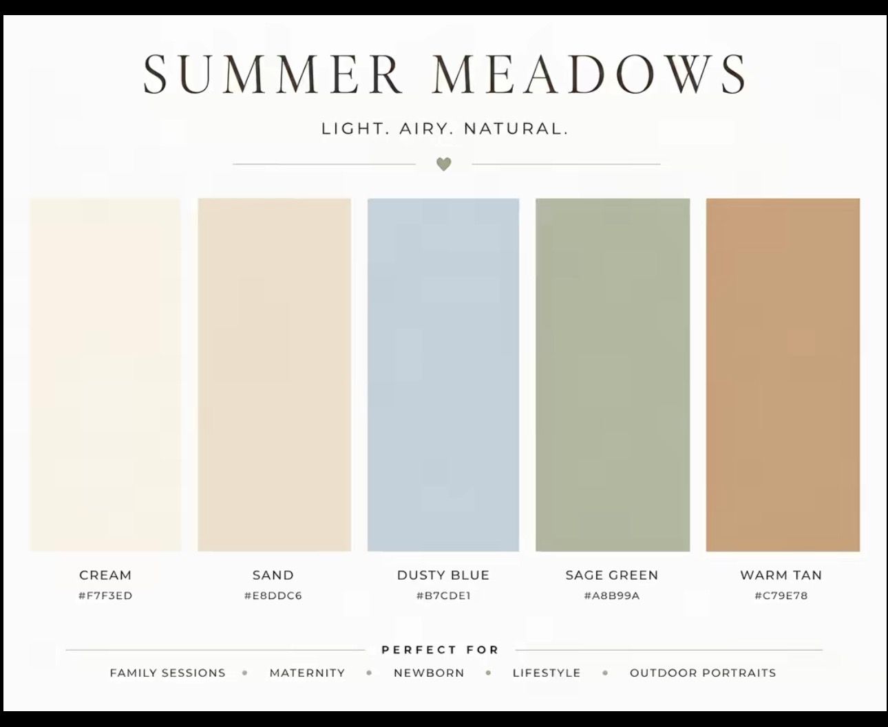
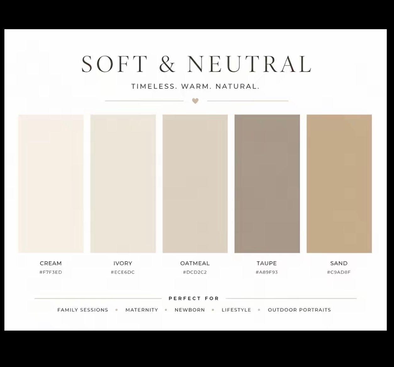
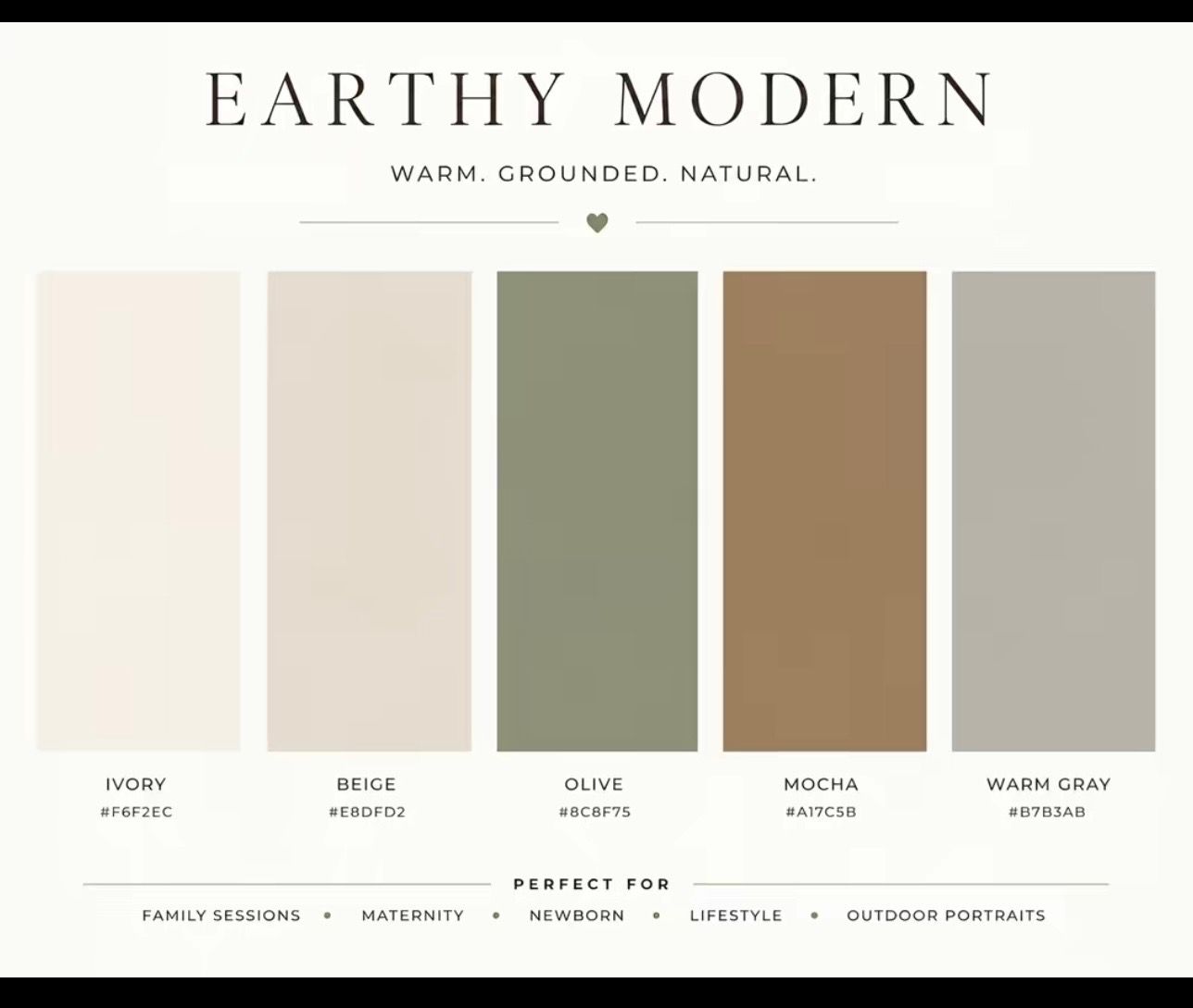
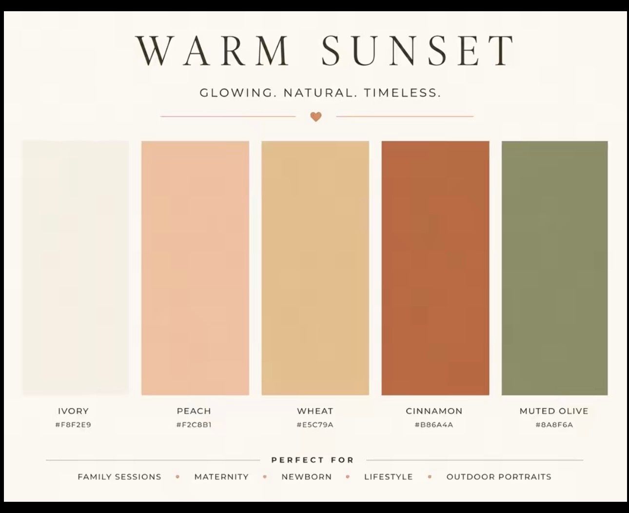
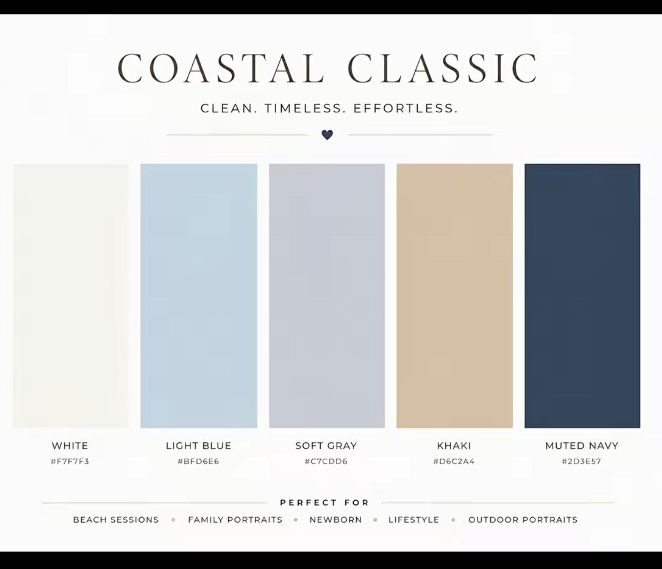
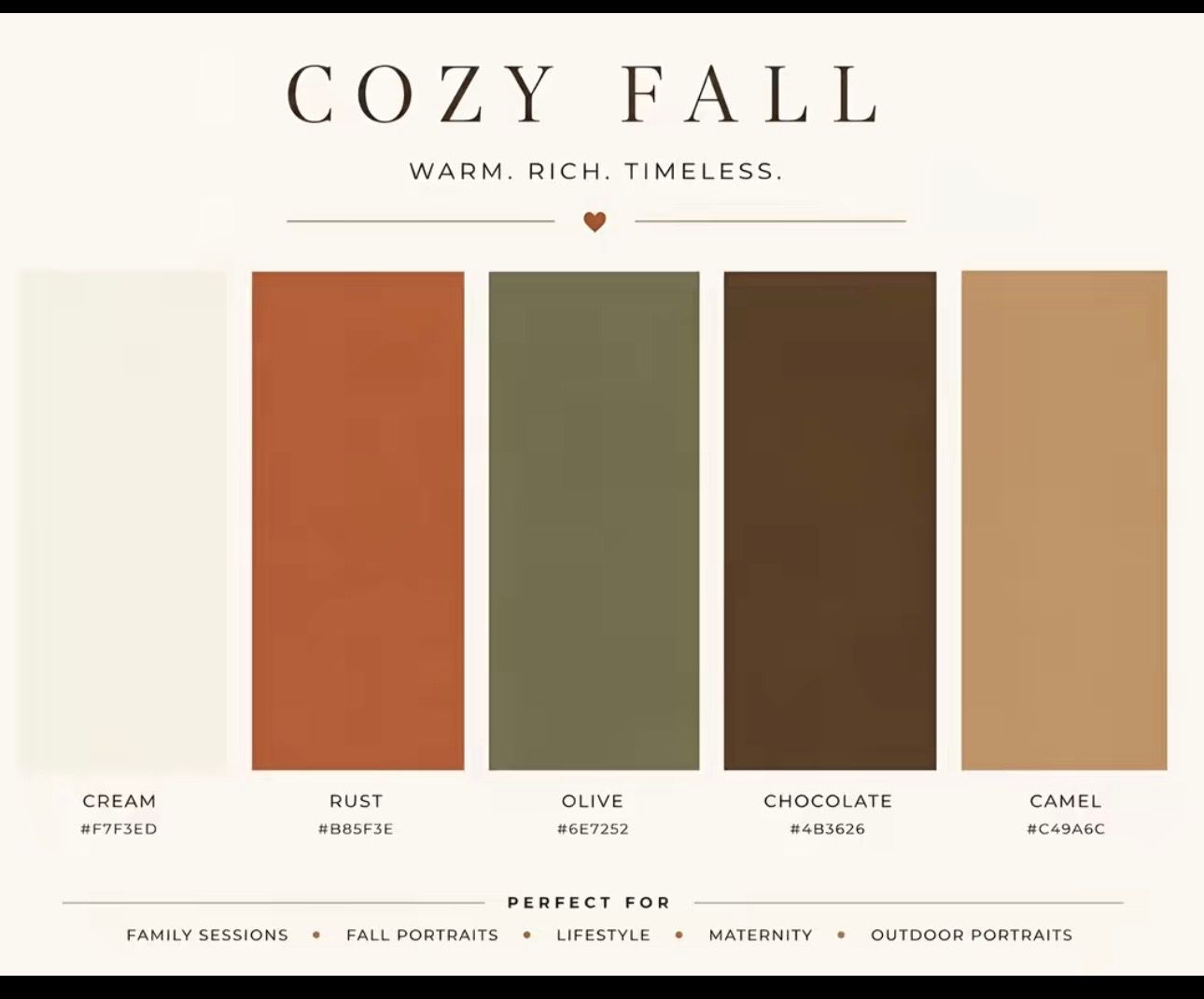
Start by considering the location and overall mood of the session
Soft, neutral colors can create a timeless and natural feel, while warmer or richer tones can add more depth and personality. Once you have a palette, mix different shades, textures, and patterns rather than matching everyone exactly.
(shown to the right you will see the utilization of the Summer Meadow palette)
Picture Perfect!
The goal is for the outfits to coordinate without looking overly planned.
A well-chosen color palette keeps the focus on the people in the photos and helps the final images feel balanced, intentional, and visually appealing.
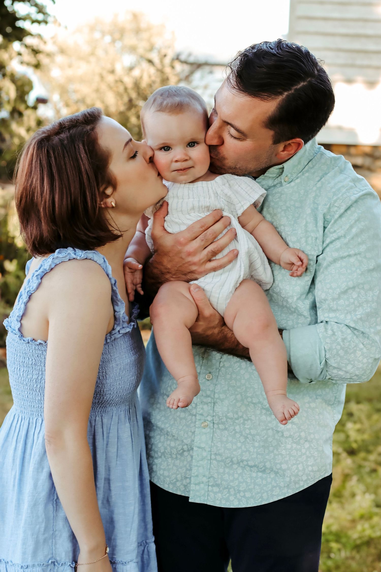
(shown to the left you will see the utilization of the Coastal Classic palette)